


Background filling effect on hover
Using box-shadow to add a background filling hover effect on text


What are we talking about?
This is one of my favorite hover effects in CSS and I've never got bored with it. We can apply this to a piece of text or to specific words that are intended to be highlighted. Let's see how it works.
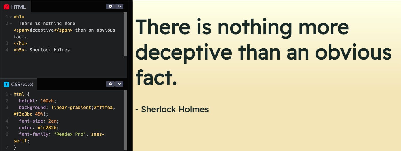
So here's a sentence with a word wrapped around a span on which we will be applying this effect.
We start by adding a box-shadow to it which gives it a slight underline.
span {
  box-shadow: 0px -8px 0px 0px #feb95f inset;
}
We can see the word start to highlight itself with the box-shadow.
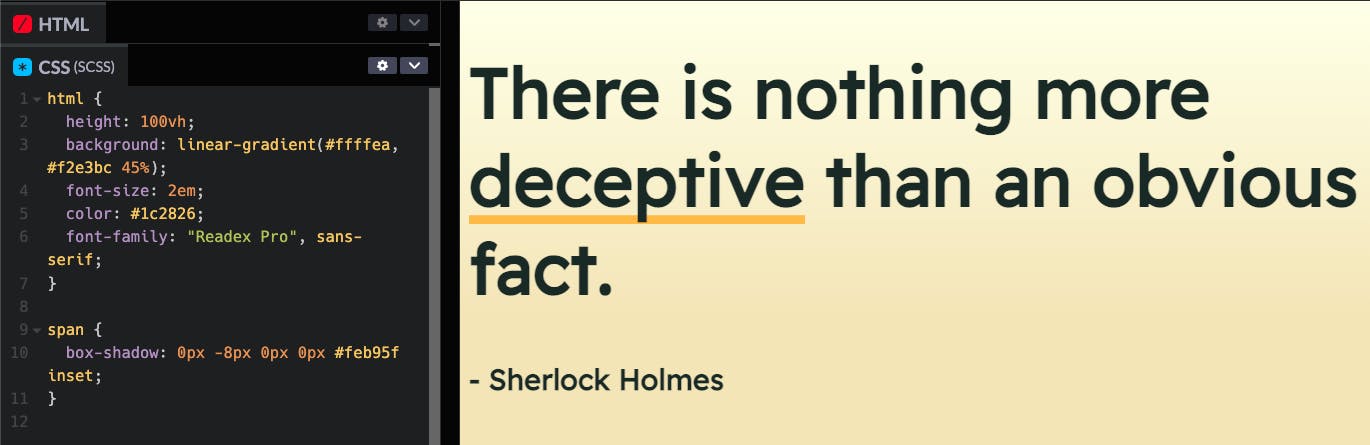
Now let's try to add the hover effect that will grow the same box-shadow in a manner that gives a filling effect.
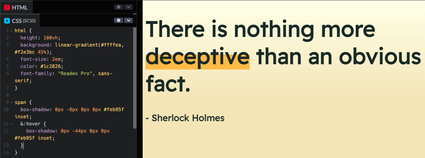
So we have the start and end state of our hover effect. Let's add a transition between them and a pointer to make it look more interactive.
transition: box-shadow 0.3s ease-in-out;
cursor: pointer;
There we have it!