How to not break Web Accessibility
Mindful design and development for inclusive web apps
💡Quick Summary: Today accessibility is a fairly known topic by many and there are a lot of best practices to follow. However, often times rather than making the app more accessible developers and designers end up as the accessories to breaking accessibility in an attempt to sometimes over engineering a solution or to override some standards.
So far as a frontend dev, I’ve learned a few things about it too. And every-time there’s something new learned, it feels like “everybody must already be knowing this”, “this is quite obvious” or “should’ve known this basic”. And as a result, I’d assume that it is a common knowledge or something elementary. Well, turns out, it is an unintentional but bad assumption. Which is why I sometimes write articles like this one Naming conventions in javascript
Here’s a list of some of the accessibility mistakes that could lead to breaking accessibility for the website/web app.
Divs for most used essential elements
Using <div> for a button or more commonly for icon buttons and using <div> in place of <p> tag or headings. It takes away the structure and meaning from these elements. Which might still look alright to you since you can visually see a heading, a sub-heading and then a paragraph or description but is it the same for a visually impaired user?
Divs for everything
Many times native semantic elements are ditched in favour of divs and spans for custom stylings. It is common to see radio input being replaced due it’s design.
There’s many advantages to using semantic elements. Browsers will be able to recognise the tags and handle them accordingly. When the browsers updates, these elements would be updated! As we see recently some of the browsers are updating the UI and adding features to specific HTML elements.
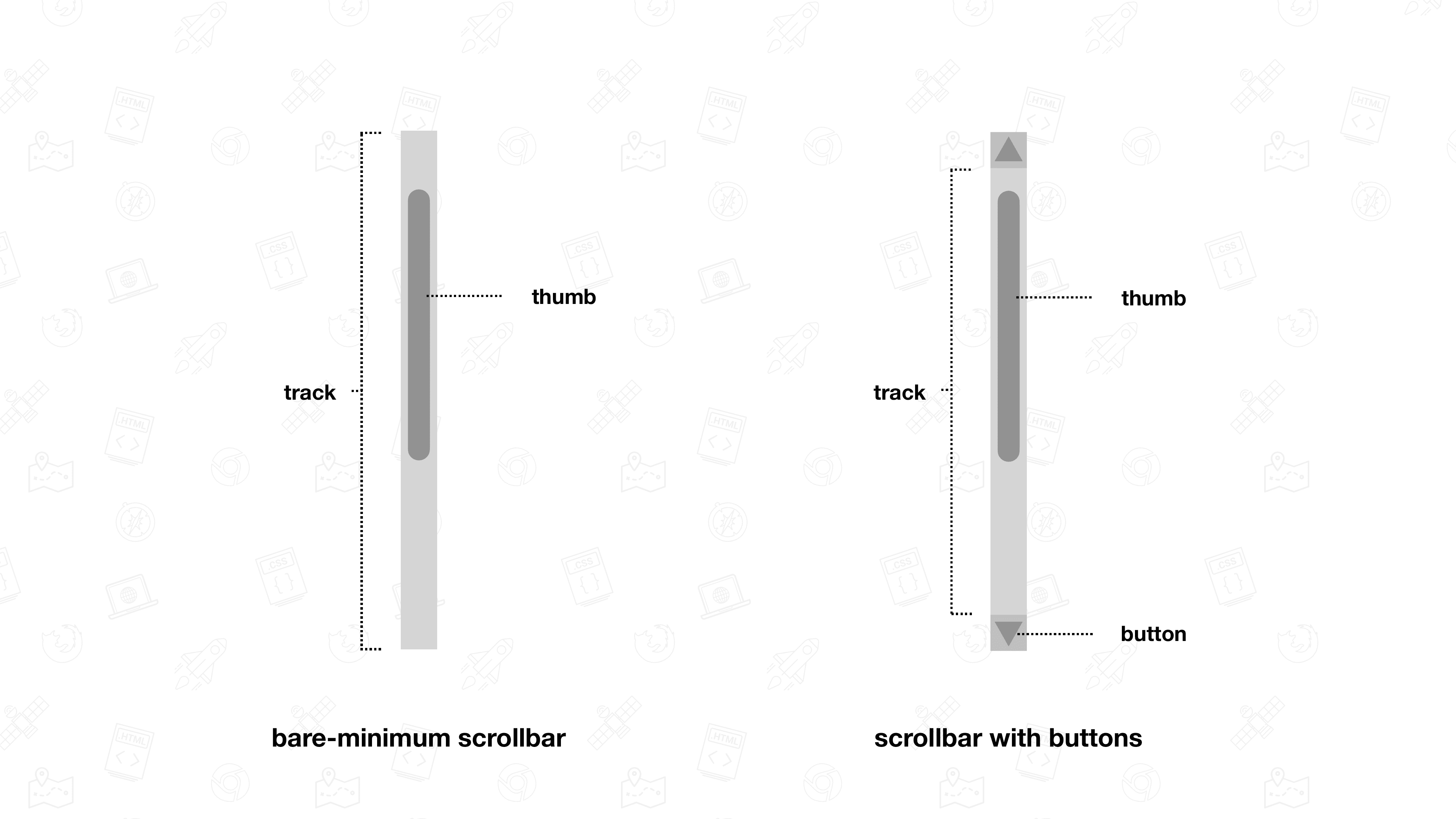
Scrollbar
When a forever mac user discovers about how the scrollbar appears on their app in a windows machine, they would want to get rid of the scrollbar all together. MacOS has a default setting of autohide for scrollbars and the design of the scrollbar is itself minimal. Which makes the permanent, old school looking windows scrollbar look annoying to many.
Browser scrollbar is one which has almost no proper support for custom styling and behaviour. Forcing changes to this element can lead to a very inconsistent user experience across browsers and end up in a disaster.
Instead try to restructure your layout to handle where the scrollbars would appear. It could mean adjusting height, overflow and hierarchy of elements.
Interestingly Michelin Design system has covered scrollbar in it.
From Chrome version 2 it's been possible to style scrollbars with the
::-webkit-scrollbar-*pseudo-elements. This approach works fine in Chrome and Safari, but was never standardized by the CSS Working Group. [Link to article]
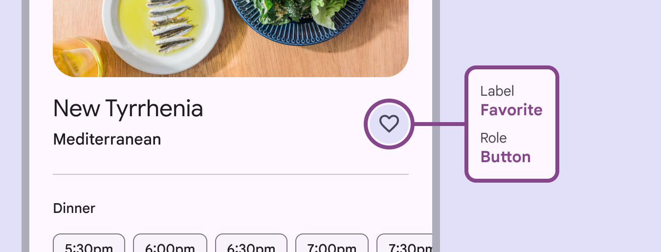
Icon buttons
Accessibility does not come by default with icon/image buttons, even if it is wrapped inside a <button>. Instead, they make it difficult for the user to understand what the button’s purpose it, how to relate or interpret the image. And for visually impaired users it is almost not usable when there is no other indication for meaning than the image itself. Assistive tech can not interpret what is the purpose of the button or what would happen if it is clicked.
So, it is important to be mindful of accessibility with these components.
To make them accessible to all users (visually impaired, hearing impaired and others), Icon buttons should include accessible attributes and a title or tooltip to display it’s text on the screen.
Material design is a great reference for everything about icon buttons.
Also check Sara Soueidan's article on Accessible icon buttons
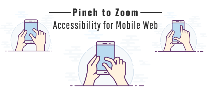
Pinch to zoom
This is a really helpful feature for the users trying to access the content on the screen in a more comfortable way by zooming into the content as needed. Again, it could be a visually impaired user or even a user with no disabilities.
Here’s some more about this topic👇
https://www.boia.org/blog/web-accessibility-tips-dont-disable-zooming-yes-even-on-mobile

https://www.deque.com/blog/accessibility-mobile-web-pinch-zoom-tutorial/
Right click
The standard right click menu that we see in the browser offers some important features to the user such as Look up, Copy link to highlight, reading mode, translation and many more. Disabling the menu on right click would take away all of these standard features which the browser supports and it is easily one of the patterns that would create user frustration and a unfavourable judgement towards the website or the product altogether.

However, It would not be the same when for example we see a custom menu on Figma. Since it is actually providing more relevant features in the menu and thus enhancing the user experience.
As a default, it would best to leave it untouched and be reasonable about it when there’s a case for a custom menu.

Text select
Disabling text selection on a page is another pattern that violates the standard behaviour and users’ expectations.
Scroll-jacking
Scrolljacking (or scroll hijacking) is a design pattern that changes the speed and, sometimes, the direction of scrolling on a web page. Here’s a detailed article on this topic https://www.nngroup.com/articles/scrolljacking-101/
Also https://keenanpayne.com/scrolling/
Apple must be known as a top user of this feature on their website, since they’ve been doing scrolljacking consistently for at least more than a decade. The result is some really impressive design and immersive experience.
How does scrolljacking impact accessibility?
Artificial links
Links that are not a <a> tag with an href but a redirection through javascript, should be avoided. Apart from the assistive tech, web-crawlers not being able to tell what it is or where it leads, even the user won’t be able to find the link accessible in many ways.
This accessibility checklist for Links from Deque University can help you make sure your links are accessible. https://dequeuniversity.com/checklists/web/links
Element focus styles
It is easy to customise the focus indicators for HTML elements, but should you do that?

This is something that is handled by the browsers but it is common to see custom focus styles in forms, links etc.
I still can’t comprehend why would you remove focus indicators altogether? For aesthetics? the default style don’t blend with your overall design? Maybe. But removing it is worse. Like from inputs, links and buttons.
Generally, when you try to overwrite some browser standard, it comes with the extra work of making sure it works as expected, is accessible and has all that the browser was doing for you. And it would be a rather misuse of the customisation if it we ignore all of those things and just apply a custom style and abandon it or in the worst case, get rid of it altogether.
Here’s again an article by Sara Soueidan
and some more readings on this topic here
https://web.dev/learn/accessibility/focus
https://www.deque.com/blog/give-site-focus-tips-designing-usable-focus-indicators/
Alt text
You could use alt text on images and still not make them any more accessible. It is important to provide a proper description, making sure that it gives the user as close of an understanding of the image as possible.
Checkout Jake and Surma talk about it on HTTP 203
More
I am the User: Unfortunately, you’re not. There’s always more detailed information, research, case studies, standards, and better resources available on a given topic. Do take advantage of all of those as much as you can.
Animations: too many elements bouncing around the page
Hiding important content
More resources 📚
https://www.youtube.com/watch?v=g2tzEil5TL0
https://css-tricks.com/when-is-it-ok-to-disable-text-selection/
https://maze.co/guides/ux-cognitive-biases/types/
https://www.accessibility-developer-guide.com/knowledge/semantics/
https://www.boia.org/blog/web-accessibility-tips-dont-disable-zooming-yes-even-on-mobile
https://www.deque.com/blog/accessibility-mobile-web-pinch-zoom-tutorial/


